
-1_jpg.webp)
BESO BY PATRIA
CLIENT
INK ENTERTAINMENT
TYPE OF CLIENT
HOSPITALITY
CATEGORY
NAME, STRATEGY, VISUAL IDENTITY, TAGLINE, COPYWRITING, GATE DESIGN & SIGNAGE, CAMPAIGN CREATIVE DIRECTION
OVERVIEW
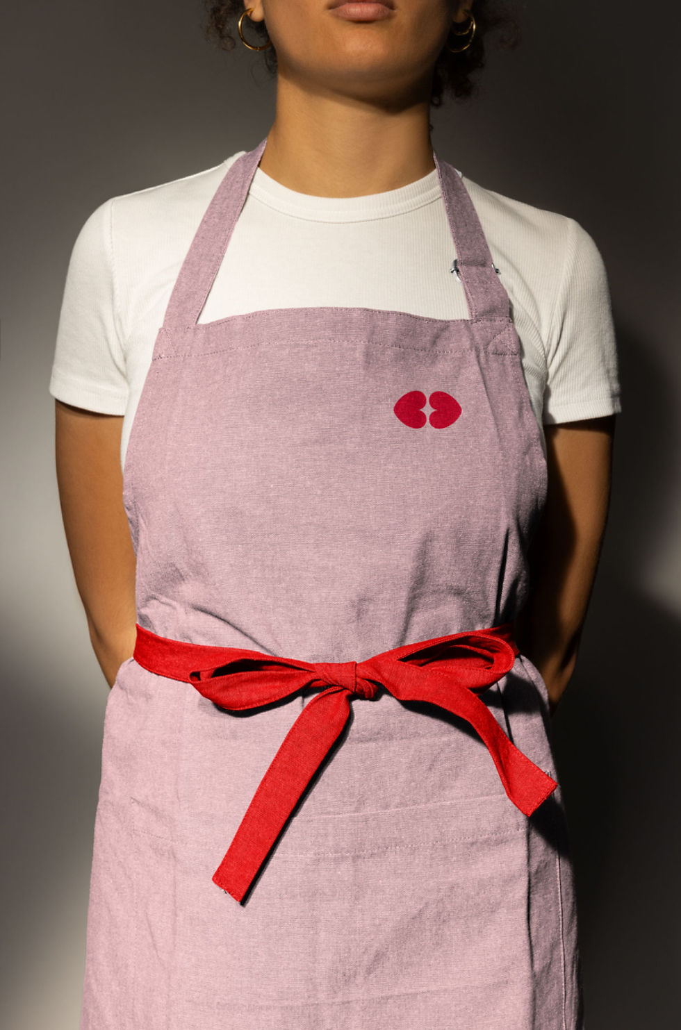
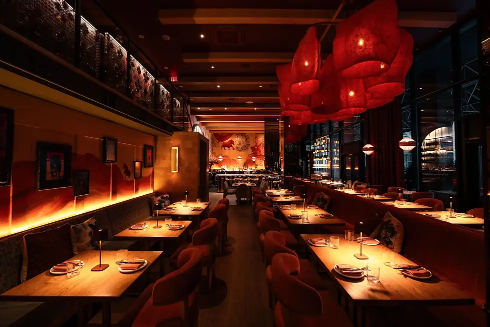
Beso, meaning “kiss” in Spanish, is a sultry new restaurant by INK Entertainment—infused with Latin spirit and modern sensuality. Flirtatious, fiery, and full of flavour, Beso by Patria delivers a bold Spanish dining experience in the heart of Toronto’s King West.
I was brought on to develop the name, brand strategy, and visual identity. The custom wordmark transforms each letter into a metaphor for a dinner guest, turning the name into a layered story of connection and chemistry. The icon captures a moment suspended in time, the magnetic tension just before a kiss. Abstract yet expressive, it hints at lips, heat, and desire, inviting interpretation while striking a balance between playfulness and sophistication. The brand’s signature palette, a flirtatious red paired with blush pink, was chosen to evoke both passion and tenderness, reflecting the emotion of a kiss and the vibrancy of Spanish culture. Together, they express Beso’s duality: bold yet soft, modern yet timeless. A Brand Standards Guide was developed for INK’s in-house team to ensure seamless rollout across all channels, preserving the spirit of the brand through launch and beyond.
Tagline: A KISS OF SPAIN IN EVERY BITE
Interior Nivek Remas
Photography Paula Wilson
APPLIED ARTS MAGAZINE FEATURE


.jpg)


_jpg.webp)
